Nooto themes allow you to change the visual presentation of your Nooto on desktop devices.
Each theme uses the same content, structure, and Markdown file.
Only the desktop layout and visual style change.
Themes help you adapt your Nooto to different goals, audiences, and types of content while keeping everything simple and easy to manage.
Nooto Classic
Nooto Classic is the original Nooto experience.
It focuses on readability, simplicity, and long-form content. Navigation, sections, and content are presented in a clean and familiar way, making it suitable for personal websites, essays, journals, archives, research projects, and general-purpose Nooto sites.
Classic is the recommended choice for users who want a balanced and timeless presentation.
Nooto Brisk
Nooto Brisk transforms your Nooto into a modern website.
It introduces a more visual and spacious desktop layout designed for organizations, businesses, portfolios, project presentations, landing pages, and public-facing websites.
Brisk keeps the simplicity of Nooto while providing a stronger website-oriented appearance.
Nooto Atlas
Nooto Atlas is designed for documentation and structured knowledge.
Inspired by modern documentation platforms, Atlas features a dedicated navigation sidebar and a layout optimized for manuals, guides, knowledge bases, reference materials, educational resources, and technical documentation.
Atlas is ideal when your content is organized into many chapters, sections, and pages.
Nooto Folio
Nooto Folio is designed for portfolios, visual storytelling, and creative work.
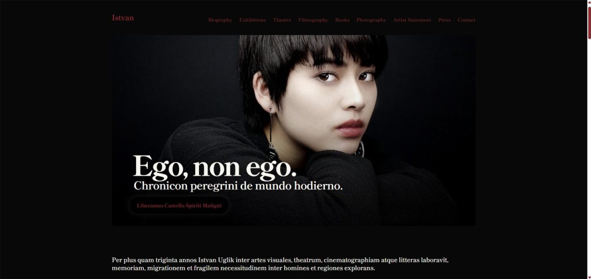
Created for artists, photographers, designers, makers, writers, studios, and independent professionals, Folio emphasizes imagery, presentation, and visual impact while preserving the simplicity of Nooto's single-file Markdown workflow.
Folio is ideal when your content revolves around projects, galleries, case studies, collections, portfolios, exhibitions, and other work that benefits from a refined visual presentation.
How to Use
Choosing a Desktop theme is simple.
Open your Nooto dashboard and go to:
Settings → Design
From there, select the Desktop Theme that best matches the purpose of your Nooto.
The selected theme will automatically be applied to the desktop version of your site.
You can change themes at any time without modifying your content. Your Markdown file, pages, images, sections, and settings remain unchanged.
Mobile Experience
All Nooto Desktop Themes are primarily designed for larger screens.
While each theme provides its own desktop layout and navigation style, the mobile experience remains intentionally simple and consistent across all themes.
This design choice helps ensure that visitors on phones and smaller devices can quickly access information without dealing with complex layouts, sidebars, multi-column structures, or advanced navigation systems that are often difficult to use on small screens.
On mobile devices, clarity and speed are usually more important than visual complexity. For this reason, Nooto prioritizes readability, accessibility, and straightforward navigation, allowing visitors to reach content quickly regardless of the selected desktop theme.